
1920*1080的设计稿。
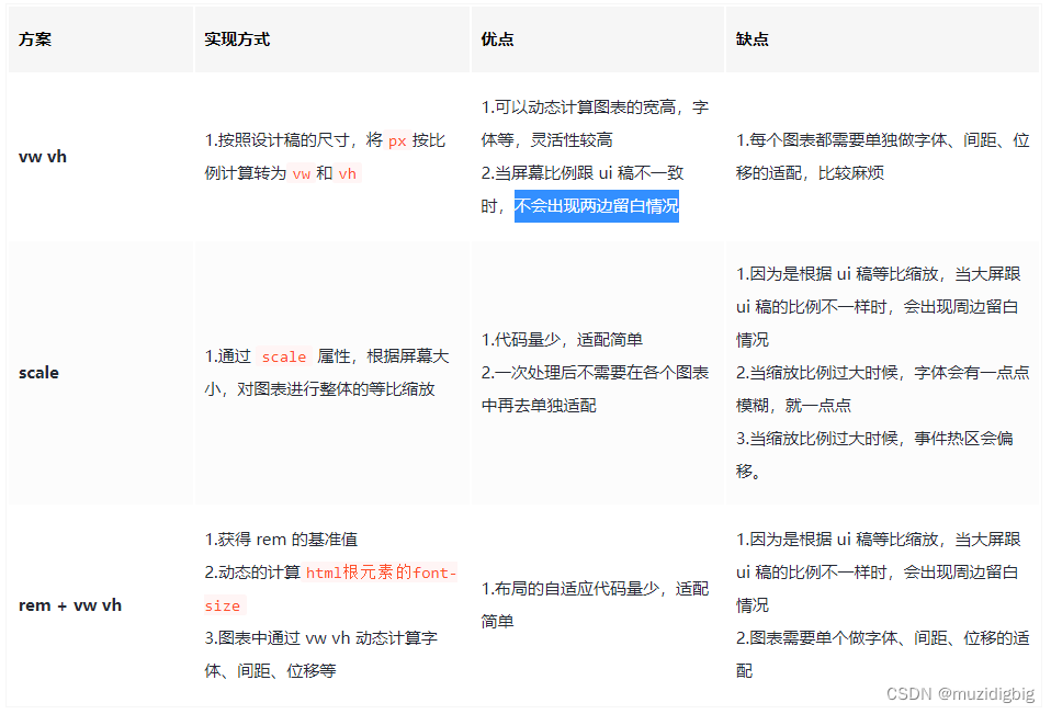
方案一:vw(单位)
假设设计稿尺寸为 1920*1080(做之前一定问清楚 ui 设计稿的尺寸)
即: 网页宽度=1920px 网页高度=1080px
我们都知道 网页宽度=100vw 网页宽度=100vh 所以,在 1920px*1080px 的屏幕分辨率下 1920px = 100vw 1080px = 100vh
这样一来,以一个宽 300px 和 200px 的 div 来说,其所占的宽高,以 vw 和 vh 为单位,
计算方式如下: vwDiv = (300px / 1920px ) * 100vw vhDiv = (200px / 1080px ) * 100vh
所以,就在 1920*1080 的屏幕分辨率下,计算出了单个 div 的宽高 当屏幕放大或者缩小时,div 还是以 vw 和 vh 作为宽高的,就会自动适应不同分辨率的屏幕
使用scss
util.scss
// 使用 scss 的 math 函数,https://sass-lang.com/documentation/breaking-changes/slash-div
@use "sass:math";

// 默认设计稿的宽度
$designWidth: 1920;
// 默认设计稿的高度
$designHeight: 1080;

// px 转为 vw 的函数
@function vw($px) {
  @return math.div($px, $designWidth) * 100vw;
}

// px 转为 vh 的函数
@function vh($px) {
  @return math.div($px, $designHeight) * 100vh;
}
路径配置
只需在
vue.config.js
里配置一下
utils.scss
的路径,就可以全局使用了
vue.config.js
const path = require("path");

function resolve(dir) {
  return path.join(__dirname, dir);
}

module.exports = {
  publicPath: "",
  configureWebpack: {
    name: "app name",
    resolve: {
      alias: {
        "@": resolve("src"),
      },
    },
  },
  css: {
    // 全局配置 utils.scs,详细配置参考 vue-cli 官网
    loaderOptions: {
      sass: {
        prependData: `@import "@/styles/utils.scss";`,
      },
    },
  },
};
如果是vite.config.ts得这样配置
  return {
    resolve: {
      // Vite路径别名配置
      alias: {
        "@": pathSrc,
      },
    },
    css: {
      // CSS 预处理器
      preprocessorOptions: {
        //define global scss variable
        scss: {
          javascriptEnabled: true,
          additionalData: `
            @use "@/styles/variables.scss" as *;
            // 必须这样配置才能生效!
            @use "@/styles/until.scss" as *;
          `,
        },
      },
    },
  };
在.vue文件中直接使用
<template>
    <div class="box">
    </div>
</template>

<script>
export default{
    name: "Box",
}
</script>

<style lang="scss" scoped="scoped">
/*
 直接使用 vw 和 vh 函数,将像素值传进去,得到的就是具体的 vw vh 单位
 */
.box{
    width: vw(300);
    height: vh(100);
    font-size: vh(16);
    background-color: black;
    margin-left: vw(10);
    margin-top: vh(10);
    border: vh(2) solid red;
}
</style>
定义 js 样式处理函数
// 定义设计稿的宽高
const designWidth = 1920;
const designHeight = 1080;

// px转vw
export const px2vw = (_px) => {
  return (_px * 100.0) / designWidth + 'vw';
};

export const px2vh = (_px) => {
  return (_px * 100.0) / designHeight + 'vh';
};

export const px2font = (_px) => {
  return (_px * 100.0) / designWidth + 'vw';
};
屏幕变化后,图表自动调整
这种使用方式有个弊端,就是屏幕尺寸发生变化后,需要手动刷新一下才能完成自适应调整
为了解决这个问题,你需要在各个图表中监听页面尺寸变化,重新调整图表,在 vue 项目中,也可以借助
element-resize-detector
,最好封装个 resize 的指令,在各图表中就只要使用该指令就可以了,毕竟作为程序员,能偷懒就偷懒
1.安装 element-resize-detector
npm install element-resize-detector --save
2.引入工具包在组件中使用或者在单独的 js 中使用
import resizeDetector from 'element-resize-detector'
3.封装 directive
// directive.js
import * as ECharts from "echarts";
import elementResizeDetectorMaker from "element-resize-detector";
import Vue from "vue";
const HANDLER = "_vue_resize_handler";
function bind(el, binding) {
  el[HANDLER] = binding.value
    ? binding.value
    : () => {
        let chart = ECharts.getInstanceByDom(el);
        if (!chart) {
          return;
        }
        chart.resize();
      };
  // 监听绑定的div大小变化,更新 echarts 大小
  elementResizeDetectorMaker().listenTo(el, el[HANDLER]);
}
function unbind(el) {
  // window.removeEventListener("resize", el[HANDLER]);
  elementResizeDetectorMaker().removeListener(el, el[HANDLER]);
  delete el[HANDLER];
}
// 自定义指令:v-chart-resize 示例:v-chart-resize="fn"
Vue.directive("chart-resize", { bind, unbind });
4.main.js中引入
import '@/directive/directive';
5.html 代码
<template>
  <div class="linechart">
    <div ref="chart" v-chart-resize class="chart"></div>
  </div>
</template>
这里要注意的是,图表中如果需要 tab 切换动态更新图表数据,在更新数据时一定不要用 echarts 的 dispose 方法先将图表移除,再重新绘制,因为 resize 指令中挂载到的图表实例还是旧的,就监听不到新的 chart 元素的 resize 了,更新数据只需要用 chart 的 setOption 方法重新设置配置项即可。
图表字体、间距、位移等尺寸自适应
echarts 的字体大小只支持具体数值(像素),不能用百分比或者 vw 等尺寸,一般字体不会去做自适应,当宽高比跟 ui 稿比例出入太大时,会出现文字跟图表重叠的情况
这里我们就需要封装一个工具函数,来处理图表中文字自适应了👇
- 默认情况下,这里以你的设计稿是 1920*1080 为例,即网页宽度是 1920px (做之前一定问清楚 ui 设计稿的尺寸)
- 把这个函数写在一个单独的工具文件
dataUtil.js里面,在需要的时候调用 - 其原理是计算出当前屏幕宽度和默认设计宽度的比值,将原始的尺寸乘以该值
- 另外,其它 echarts 的配置项,比如间距、定位、边距也可以用该函数
1.编写 dataUtil.js 工具函数
// Echarts图表字体、间距自适应
export const fitChartSize = (size,defalteWidth = 1920) => {
  let clientWidth = window.innerWidth||document.documentElement.clientWidth||document.body.clientWidth;
  if (!clientWidth) return size;
  let scale = (clientWidth / defalteWidth);
  return Number((size*scale).toFixed(3));
}
2.将函数挂载到原型上
import {fitChartSize} from '@src/utils/dataUtil.js'
Vue.prototype.fitChartFont = fitChartSize;
3.这样你可以在
.vue
文件中直接使用
this.fitChartSize()
调用
<template>
  <div class="chartsdom" ref="chart" v-chart-resize></div>
</template>

<script>
export default {
  name: "dashboardChart",
  data() {
    return {
      option: null,
    };
  },
  mounted() {
    this.getEchart();
  },
  methods: {
    getEchart() {
      let myChart = this.$echarts.init(this.$refs.chart);
      const option = {
        backgroundColor: "transparent",
        tooltip: {
          trigger: "item",
          formatter: "{a} <br/>{b} : {c}%",
        },
        grid: {
          left: this.fitChartSize(10),
          right: this.fitChartSize(20),
          top: this.fitChartSize(20),
          bottom: this.fitChartSize(10),
          containLabel: true,
        },
        calculable: true,
        series: [
          {
            color: ["#0db1cdcc"],
            name: "计划投入",
            type: "funnel",
            width: "45%",
            height: "70%",
            x: "5%",

            minSize: "10%",
            funnelAlign: "right",

            center: ["50%", "50%"], // for pie

            data: [
              {
                value: 30,
                name: "下单30%",
              },
              {
                value: 55,
                name: "咨询55%",
              },
              {
                value: 65,
                name: "点击65%",
              },
              {
                value: 60,
                name: "访问62%",
              },
              {
                value: 80,
                name: "展现80%",
              },
            ].sort(function (a, b) {
              return a.value - b.value;
            }),
            roseType: true,
            label: {
              normal: {
                formatter: function () {},
                position: "inside",
              },
            },
            itemStyle: {
              normal: {
                borderWidth: 0,
                shadowBlur: this.fitChartSize(20),
                shadowOffsetX: 0,
                shadowOffsetY: this.fitChartSize(5),
                shadowColor: "rgba(0, 0, 0, 0.3)",
              },
            },
          },

          {
            color: ["#0C66FF"],
            name: "实际投入",
            type: "funnel",
            width: "45%",
            height: "70%",
            x: "50%",

            minSize: "10%",
            funnelAlign: "left",

            center: ["50%", "50%"], // for pie

            data: [
              {
                value: 35,
                name: "下单35%",
              },
              {
                value: 40,
                name: "咨询40%",
              },
              {
                value: 70,
                name: "访问70%",
              },
              {
                value: 90,
                name: "点击90%",
              },
              {
                value: 95,
                name: "展现95%",
              },
            ].sort(function (a, b) {
              return a.value - b.value;
            }),
            roseType: true,
            label: {
              normal: {
                position: "inside",
              },
            },
            itemStyle: {
              normal: {
                borderWidth: 0,
                shadowBlur: this.fitChartSize(20),
                shadowOffsetX: 0,
                shadowOffsetY: this.fitChartSize(5),
                shadowColor: "rgba(0, 0, 0, 0.3)",
              },
            },
          },
        ],
      };
      myChart.setOption(option, true);
    },
  },
  beforeDestroy() {},
};
</script>

<style lang="scss" scoped>
.chartsdom {
  width: 100%;
  height: 100%;
}
</style>
方案二:scale(缩放)强烈推荐
我们整个大屏的尺寸设置和设计图一样,只是通过css的scale放大缩小属性,来控制实际展示的大小。
通过监听浏览器窗口的大小,来改变scale的比例,从而实现数据大屏适配。(百度、网易等大数据适配的解决方案均是这个)
设计稿宽高比是 1920 * 1080
缺点:1.因为是根据 ui 稿等比缩放,当大屏跟 ui 稿的比例不一样时,会出现周边留白情况 2.当缩放比例过大时候,字体会有一点点模糊,就一点点 3.当缩放比例过大时候,事件热区会偏移。
空白的部分用背景图片填充就好了。
<template>
    <div class="container">
        <!-- 数据大屏展示内容区域 -->
        <div class="screen" ref="screen">
            <div class="top">
                <Top></Top>
            </div>
            <div class="bottom">
                <div class="left">左侧</div>
                <div class="center">中间</div>
                <div class="right">右侧</div>
            </div>
        </div>
    </div>
</template>

<script setup lang="ts">
import Top from './components/top/index.vue'

import { ref, onMounted } from 'vue'

//获取数据大屏展示内容盒子的DOM元素
let screen = ref()
onMounted(() => {
    screen.value.style.transform = `scale(${getScale()}) translate(-50%,-50%)`
    // screen.value.style.transform = `translate(-50%,-50%) scale(${getScale().ww},${getScale().wh})`;

})
//定义大屏缩放比例
function getScale(w = 1920, h = 1080) {
    const ww = window.innerWidth / w
    const wh = window.innerHeight / h
    return ww < wh ? ww : wh;
    // return { ww, wh };
}
// 根据浏览器大小推断缩放比例
// 首先要确定设计稿尺寸,默认是 1920 x 1080
// 分别计算浏览器和设计图宽高比
// 如果浏览器的宽高比大于设计稿的宽高比,就取浏览器高度和设计稿高度之比
// 如果浏览器的宽高比小于设计稿的宽高比,就取浏览器宽度和设计稿宽度之比
//监听视口变化
window.onresize = () => {
    screen.value.style.transform = `scale(${getScale()}) translate(-50%,-50%)`
}
</script>

<style scoped lang="scss">
.container {
    width: 100vw;
    height: 100vh;
    background: url(./images/bg.png) no-repeat;
    background-size: cover;
    .screen {
        /* 注意:width,height 原稿多大就设多大 */
        width: 1920px;
        height: 1080px;
        position: fixed;
        left: 50%;
        top: 50%;
        // transform-origin: left top;
        transform: translate(-50%, -50%);
        .top {
            width: 100%;
            height: 40px;
        }
        .bottom {
            display: flex;
            .left {
                flex: 1;
                height: 1040px;
                display: flex;
                flex-direction: column;
                .tourist {
                    flex: 1.2;
                }
                .sex {
                    flex: 1;
                }
                .age {
                    flex: 1;
                }
            }
            .center {
                flex: 2;
            }
            .right {
                flex: 1;
            }
        }
    }
}
</style>
- 获取数据大屏展示内容区域的 DOM 元素。
- style.transform:这是访问元素的 transform 样式属性。transform 是一个 CSS 属性,用于对元素进行变换,例如旋转、缩放、平移等。
- scale(${getScale()}):这部分代码中,getScale() 函数返回一个缩放比例,这个比例会应用在 scale() 函数中。这样,页面元素会按照指定的比例进行缩放。缩放比例是根据窗口大小和设计稿大小计算的,以确保内容适应不同的屏幕尺寸。
- translate(-50%, -50%):这部分代码中,translate() 函数用于对元素进行平移。在这里,它将元素的中心点平移到屏幕的中心。-50% 表示水平和垂直方向都要将元素平移到其自身宽度和高度的一半的位置,从而实现居中效果。
- transform-origin 是 CSS 属性,用于指定元素的变换(比如旋转、缩放、平移等)的原点位置,即元素围绕哪个点进行变换操作。在你提供的样式中,transform-origin 设置为 left top,这意味着元素的变换原点位于元素的左上角。
方案三:插件v-scale-screen
它其实也是通过 scale 进行等比例计算放大和缩小的,和方案二的原理是一样的,还可以通过api调整样式,源码地址和对应的API
使用方法:
1.vue2请使用v-scale-screen@1.0.0版本,vue3请使用v-scale-screen@2.0.0版本
npm install v-scale-screen@1.0.0 -save
or
yarn add v-scale-screen
2.使用-vue2中使用插件导入,vue3以组件导入
vue2
// main.js
import VScaleScreen from 'v-scale-screen'
Vue.use(VScaleScreen)
组件内使用
//html
<v-scale-screen width="1920" height="1080" :boxStyle="boxStyle">
  <div>
    <v-chart>....</v-chart>
    <v-chart>....</v-chart>
    <v-chart>....</v-chart>
    <v-chart>....</v-chart>
    <v-chart>....</v-chart>
  </div>
</v-scale-screen>
//js
    data() {
        return {
            boxStyle: {
                backgroundColor: 'green'
            },
        }
vue3
<v-scale-screen width="1920" height="1080">
  <div>
    <v-chart>....</v-chart>
    <v-chart>....</v-chart>
    <v-chart>....</v-chart>
    <v-chart>....</v-chart>
    <v-chart>....</v-chart>
  </div>
</v-scale-screen>
<script>
import VScaleScreen from 'v-scale-screen'
export default {
  components:{
    VScaleScreen
  }
}
</script>
版权归原作者 muzidigbig 所有, 如有侵权,请联系我们删除。