

Seaborn是Python中的一个库,主要用于生成统计图形。

Seaborn是构建在matplotlib之上的数据可视化库,与Python中的pandas数据结构紧密集成。可视化是Seaborn的核心部分,可以帮助探索和理解数据。
要了解Seaborn,就必须熟悉Numpy和Matplotlib以及pandas。
Seaborn提供以下功能:
- 面向数据集的API来确定变量之间的关系。
- 线性回归曲线的自动计算和绘制。
- 它支持对多图像的高级抽象绘制。
- 可视化单变量和双变量分布。
这些只是Seaborn提供的功能的一部分,还有很多其他功能,我们可以在这里探索所有的功能。
要引入Seaborn库,使用的命令是:
importseabornassns
使用Seaborn,我们可以绘制各种各样的图形,如:
- 分布曲线
- 饼图和柱状图
- 散点图
- 配对图
- 热力图
在文章中,我们使用从Kaggle下载的谷歌Playstore数据集。
1.分布曲线
我们可以将Seaborn的分布图与Matplotlib的直方图进行比较。它们都提供非常相似的功能。这里我们画的不是直方图中的频率图,而是y轴上的近似概率密度。
我们将在代码中使用**sns.distplot()**来绘制分布图。
在进一步之前,首先,让我们访问我们的数据集,
 importpandasaspd
 importnumpyasnp
 pstore = pd.read_csv("googleplaystore.csv")
 pstore.head(10)
从我们的系统访问数据集
数据集是这样的,
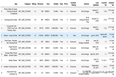
从Kaggle获得的谷歌播放商店数据集
现在,让我们看看如果我们绘制来自上述数据集的“Rating”列的分布图是怎样的,
 #importing all the libraries
 importnumpyasnp
 importpandasaspd
 importmatplotlib.pyplotasplt
 importseabornassns

 #Create a distribution plot for rating
 sns.distplot(pstore.Rating)
 plt.show()
Rating列分布图的代码
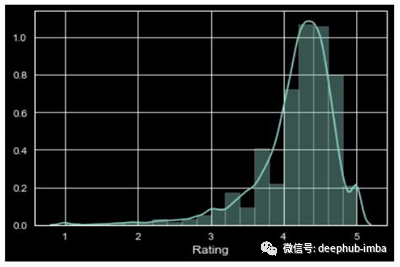
Rating列的分布图是这样的,
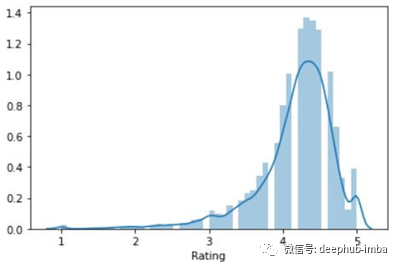
在这里,曲线(KDE)显示在分布图上的是近似的概率密度曲线。
与matplotlib中的直方图类似,在分布方面,我们也可以改变类别的数量,使图更容易理解。
我们只需要在代码中加上类别的数量,
 #Change the number of bins
 sns.distplot(inp1.Rating, bins=20, kde = False)
 plt.show()
图像是这样的,
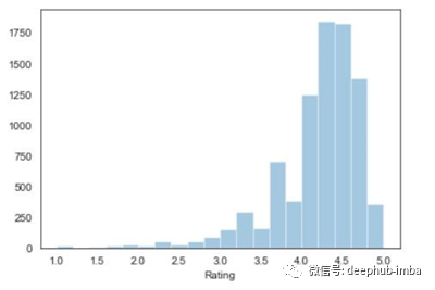
特定类别数的分布图
在上图中,没有概率密度曲线。要移除曲线,我们只需在代码中写入**' kde = False '**。
我们还可以向分布图提供与matplotlib类似的容器的标题和颜色。让我们看看它的代码,
 #importing all the libraries
 importnumpyasnp
 importpandasaspd
 importmatplotlib.pyplotasplt
 importseabornassns

 #Create a distribution plot for rating
 sns.distplot(pstore.Rating, bins=20, color="g")
 plt.title("Distribution of app ratings", fontsize=20, color = 'red')
 plt.show()
同一列Rating的分布图是这样的:
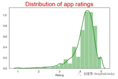
有标题的分布图
对Seaborn图形进行样式化
使用Seaborn的最大优势之一是,它为图形提供了广泛的默认样式选项。
这些是Seaborn提供的默认样式。
 'Solarize_Light2',
 '_classic_test_patch',
 'bmh',
 'classic',
 'dark_background',
 'fast',
 'fivethirtyeight',
 'ggplot',
 'grayscale',
 'seaborn',
 'seaborn-bright',
 'seaborn-colorblind',
 'seaborn-dark',
 'seaborn-dark-palette',
 'seaborn-darkgrid',
 'seaborn-deep',
 'seaborn-muted',
 'seaborn-notebook',
 'seaborn-paper',
 'seaborn-pastel',
 'seaborn-poster',
 'seaborn-talk',
 'seaborn-ticks',
 'seaborn-white',
 'seaborn-whitegrid',
 'tableau-colorblind10'
我们只需要编写一行代码就可以将这些样式合并到我们的图中。
 #importing all the libraries
 importnumpyasnp
 importpandasaspd
 importmatplotlib.pyplotasplt
 importseabornassns

 #Adding dark background to the graph
 plt.style.use("dark_background")

 #Create a distribution plot for rating
 sns.distplot(pstore.Rating, bins=20, color="g")
 plt.title("Distribution of app ratings", fontsize=20, color = 'red')
 plt.show()
在将深色背景应用到我们的图表后,分布图看起来是这样的,
深色背景的分布图
2.饼图和柱状图
饼图通常用于分析数字变量在不同类别之间如何变化。
在我们使用的数据集中,我们将分析内容Rating栏中的前4个类别的执行情况。
首先,我们将对内容Rating列进行一些数据清理/挖掘,并检查其中的类别。
 #importing all the libraries
 importnumpyasnp
 importpandasaspd
 importmatplotlib.pyplotasplt
 importseabornassns

 #Analyzing the Content Rating column
 pstore['Content Rating'].value_counts()
类别列表是,
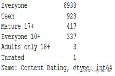
Rating列数
根据上面的输出,由于“只有18岁以上的成年人”和“未分级”的数量比其他的要少得多,我们将从内容分级中删除这些类别并更新数据集。
 #importing all the libraries
 importnumpyasnp
 importpandasaspd
 importmatplotlib.pyplotasplt
 importseabornassns

 #Remove the rows with values which are less represented
 pstore = pstore[~pstore['Content Rating'].isin(["Adults only 18+","Unrated"])]

 #Resetting the index
 pstore.reset_index(inplace=True, drop=True)

 #Analyzing the Content Rating column again
 pstore['Content Rating'].value_counts()
更新后在“Rating”栏中出现的类别是:
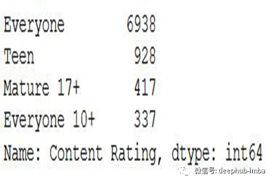
更新数据集后的Rating计数
现在,让我们为Rating列中出现的类别绘制饼图。
 #importing all the libraries
 importnumpyasnp
 importpandasaspd
 importmatplotlib.pyplotasplt
 importseabornassns

 #Plotting a pie chart
 plt.figure(figsize=[9,7])
 pstore['Content Rating'].value_counts().plot.pie()
 plt.show()
上面代码的饼状图如下所示,
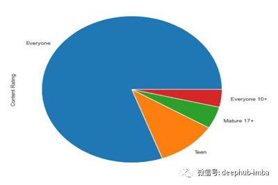
用于Rating的饼状图
从上面的饼图中,我们不能正确的推断出“所有人10+”和“成熟17+”。当这两类人的价值观有点相似的时候,很难评估他们之间的差别。
我们可以通过将上述数据绘制成柱状图来克服这种情况。
 #importing all the libraries
 importnumpyasnp
 importpandasaspd
 importmatplotlib.pyplotasplt
 importseabornassns

 #Plotting a bar chart
 plt.figure(figsize=[9,7])
 pstore['Content Rating'].value_counts().plot.barh()
 plt.show()
柱状图如下所示,
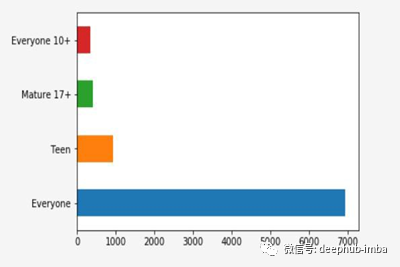
Rating栏的条形图
与饼图类似,我们也可以定制柱状图,使用不同的柱状图颜色、图表标题等。
3.散点图
到目前为止,我们只处理数据集中的一个数字列,比如评级、评论或大小等。但是,如果我们必须推断两个数字列之间的关系,比如“评级和大小”或“评级和评论”,会怎么样呢?
当我们想要绘制数据集中任意两个数值列之间的关系时,可以使用散点图。此图是机器学习领域的最强大的可视化工具。
让我们看看数据集评级和大小中的两个数字列的散点图是什么样子的。首先,我们将使用matplotlib绘制图,然后我们将看到它在seaborn中的样子。
使用matplotlib的散点图
 #import all the necessary libraries
 #Plotting the scatter plot
 plt.scatter(pstore.Size, pstore.Rating)
 plt.show()
图是这样的
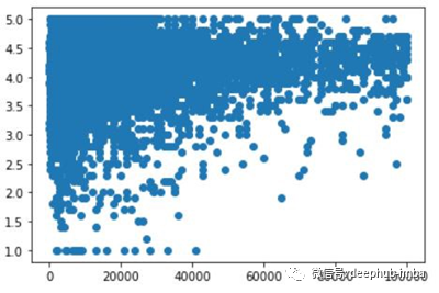
使用Matplotlib的散点图
使用Seaborn的散点图
在直方图和散点图的代码中,我们将使用**sn .joinplot()**。
**sns.scatterplot()**散点图的代码。
 #importing all the libraries
 importnumpyasnp
 importpandasaspd
 importmatplotlib.pyplotasplt
 importseabornassns

 # Plotting the same thing now using a jointplot
 sns.jointplot(pstore.Size, pstore.Rating)
 plt.show()
上面代码的散点图如下所示,
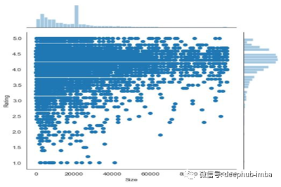
使用Seaborn的散点图
在seaborn中使用散点图的主要优点是,我们将同时得到散点图和直方图。
如果我们想在代码中只看到散点图而不是组合图,只需将其改为“scatterplot”
回归曲线
回归图在联合图(散点图)中建立了2个数值参数之间的回归线,并有助于可视化它们的线性关系。
 #importing all the libraries
 importnumpyasnp
 importpandasaspd
 importmatplotlib.pyplotasplt
 importseabornassns

 # Plotting the same thing now using a jointplot
 sns.jointplot(pstore.Size, pstore.Rating, kind = "reg")
 plt.show()
图是这样的,
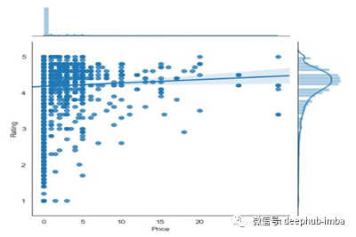
在Seaborn中使用jointplot进行回归分析
从上图中我们可以推断出,当app的价格上升时,评级会稳步上升。
4.配对图
当我们想要查看超过3个不同数值变量之间的关系模式时,可以使用配对图。例如,假设我们想要了解一个公司的销售如何受到三个不同因素的影响,在这种情况下,配对图将非常有用。
让我们为数据集的评论、大小、价格和评级列创建一对图。
我们将在代码中使用**sns.pairplot()**一次绘制多个散点图。
 #importing all the libraries
 importnumpyasnp
 importpandasaspd
 importmatplotlib.pyplotasplt
 importseabornassns

 # Plotting the same thing now using a jointplot
 sns.pairplot(pstore[['Reviews', 'Size', 'Price','Rating']])
 plt.show()
上面图形的输出图形是这样的,
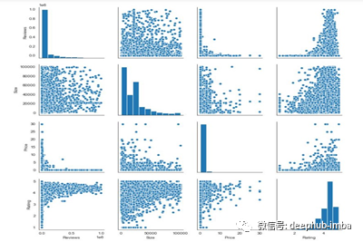
使用Seaborn的配对图
- 对于非对角视图,图像是两个数值变量之间的散点图
- 对于对角线视图,它绘制一个柱状图,因为两个轴(x,y)是相同的。
5.热力图
热图以二维形式表示数据。热图的最终目的是用彩色图表显示信息的概要。它利用了颜色强度的概念来可视化一系列的值。
我们在足球比赛中经常看到以下类型的图形,
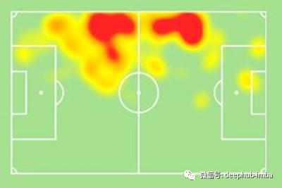
足球运动员的热图
在Seaborn中创建这个类型的图。
我们将使用**sn .heatmap()**绘制可视化图。
当你有以下数据时,我们可以创建一个热图。
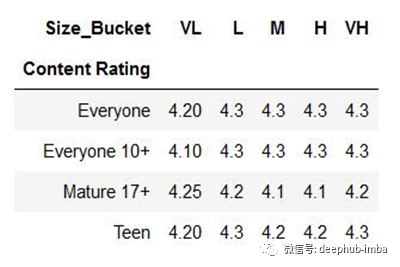
上面的表是使用来自Pandas的透视表创建的。
现在,让我们看看如何为上表创建一个热图。
 #importing all the libraries
 importnumpyasnp
 importpandasaspd
 importmatplotlib.pyplotasplt
 importseabornassns

 ##Plot a heat map
 sns.heatmap(heat)
 plt.show()
在上面的代码中,我们已经将数据保存在新的变量“heat”中。
热图如下所示,
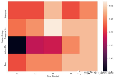
使用Seaborn创建默认热图
我们可以对上面的图进行一些自定义,也可以改变颜色梯度,使最大值的颜色变深,最小值的颜色变浅。
更新后的代码是这样的,
 #importing all the libraries
 importnumpyasnp
 importpandasaspd
 importmatplotlib.pyplotasplt
 importseabornassns

 #Applying some customization to the heat map
 sns.heatmap(heat, cmap = "Greens", annot=True)
 plt.show()
上面代码的热图是这样的,
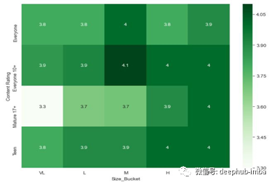
带有一些自定义的热图代码
在我们给出“annot = True”的代码中,当annot为真时,图中的每个单元格都会显示它的值。如果我们在代码中没有提到annot,那么它的默认值为False。
Seaborn还支持其他类型的图形,如折线图、柱状图、堆叠柱状图等。但是,它们提供的内容与通过matplotlib创建的内容没有任何不同。
结论
这就是Seaborn在Python中的工作方式以及我们可以用Seaborn创建的不同类型的图形。正如我已经提到的,Seaborn构建在matplotlib库之上。因此,如果我们已经熟悉Matplotlib及其函数,我们就可以轻松地构建Seaborn图并探索更深入的概念。
感谢您的阅读!!
作者:Kaushik Katari
deephub翻译组:孟翔杰
DeepHub
微信号 : deephub-imba
每日大数据和人工智能的重磅干货
大厂职位内推信息
长按识别二维码关注 ->
喜欢就请三连暴击!********** **********