
Ant Design Charts
自定义图例 legend
关闭图例
legend: false;
图例配置参数,布局类型 layout 图例展示位置 position
legend: {
  layout: 'horizontal',
  position: 'right'
}
布局类型 layout
optional horizontal | vertical
图例布局方式。提供横向布局和纵向布局。
图例展示位置 position
图例位置,可选项:‘top’, ‘top-left’, ‘top-right’, ‘left’, ‘left-top’, ‘left-bottom’, ‘right’, ‘right-top’, ‘right-bottom’, ‘bottom’, ‘bottom-left’, ‘bottom-right’。
import React, { useState, useEffect } from 'react';
import ReactDOM from 'react-dom';
import { Pie } from '@ant-design/plots';
const DemoPie = () => {
  const data = [
    {
      type: '分类一',
      value: 27,
    },
    {
      type: '分类二',
      value: 25,
    },
    {
      type: '分类三',
      value: 18,
    },
  ];
  const config = {
    appendPadding: 10,
    data,
    angleField: 'value',
    colorField: 'type',
    radius: 0.9,
    legend: {
     position: 'bottom'
    },
  };
  return <Pie{...config}/>;
};

ReactDOM.render(<DemoPie/>, document.getElementById('container'));
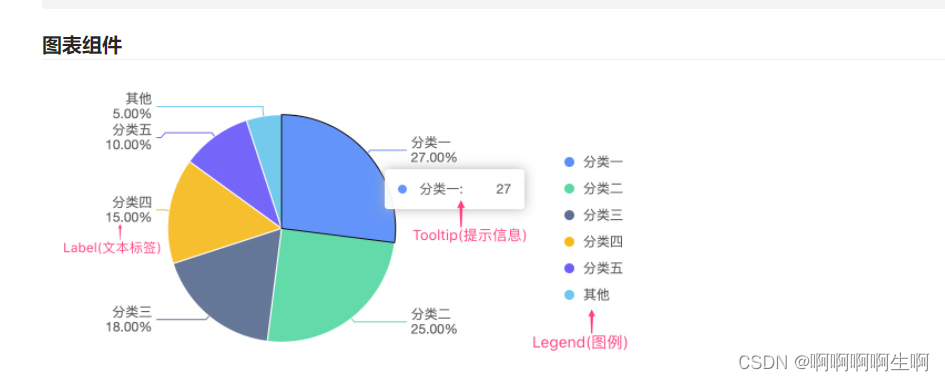
自定义文本标签 label
属性名 类型 介绍
type string 当用户使用了自定义的 label 类型,需要声明具体的 type 类型,否则会使用默认的 label 类型渲染(饼图 label 支持 `inner
offset number label 的偏移量
offsetX number label 相对于数据点在 X 方向的偏移距离
offsetY number label 相对于数据点在 Y 方向的偏移距离
content *string IGroup
style ShapeAttrs label 文本图形属性样式
autoRotate string 是否自动旋转,默认 true
rotate number 文本旋转角度
labelLine null boolean
labelEmit boolean 只对极坐标下的文本生效,表示文本是否按照角度进行放射状显示,true 表示开启,false 表示关闭
layout *‘overlap’ ‘fixedOverlap’
position *‘top’ ‘bottom’
animate boolean AnimateOption
formatter Function 格式化函数
autoHide boolean 是否自动隐藏,默认 false
import
 React, { useState, useEffect } from 'react';
import ReactDOM from 'react-dom';
import { Pie } from '@ant-design/plots';
const DemoPie = () => {
  const data = [
    {
      type: '分类一',
      value: 27,
    },
    {
      type: '分类二',
      value: 25,
    },
    {
      type: '分类三',
      value: 18,
    },
  ];
  const config = {
    appendPadding: 10,
    data,
    angleField: 'value',
    colorField: 'type',
    radius: 0.9,
    label: {
       // 可手动配置 label 数据标签位置
       position: 'middle',
       // 'top', 'bottom', 'middle'
       // 可配置附加的布局方法
       layout: [
         // 柱形图数据标签位置自动调整
         {
           type: 'interval-adjust-position',
         }, // 数据标签防遮挡
         {
           type: 'interval-hide-overlap',
         }, // 数据标签文颜色自动调整
         {
           type: 'adjust-color',
         },
       ],
     },
  };
  return <Pie{...config}/>;
};

ReactDOM.render(<DemoPie/>, document.getElementById('container'));
自定义提示信息 tooltip
指定 tooltip 中显示的字段,默认不同图表有不同的默认字段列表。配合 formatter 配置一起使用,效果更佳。
tooltip: {
  fields: ['想要显示的字段一般是data中的值或者x,y轴数据'],
}
格式化 tooltip item 内容
tooltip: {
  formatter: (item) => {
    return { name: item.type, value: item.value + '%' };
  },
}
格式化 输出样式 itemTpl
import
 React, { useState, useEffect } from 'react';
import ReactDOM from 'react-dom';
import { Pie } from '@ant-design/plots';
const DemoPie = () => {
  const data = [
    {
      type: '分类一',
      value: 27,
      percent:30,
    },
    {
      type: '分类二',
      value: 25,
      percent:30,
    },
    {
      type: '分类三',
      value: 18,
      percent:40,
    },
  ];
  const config = {
    appendPadding: 10,
    data,
    angleField: 'value',
    colorField: 'type',
    radius: 0.9,
     tooltip: {
        showTitle: false,//关闭标题
        fields: ['type', 'percent', 'value'],
        formatter: (item) => {
          return { type: item.type, percent: item.percent,value:item.value};
        },
        itemTpl: '<div><pclass="g2-tooltip-item"><spanstyle="background-color:{color};"class="g2-tooltip-marker"></span>{type}</p><pclass="g2-tooltip-item"><spanclass="g2-tooltip-marker"></span>{value}</p><pclass="g2-tooltip-item"><spanclass="g2-tooltip-marker"></span>{percent} %</p></div>'

      }
  };
  return <Pie{...config}/>;
};

ReactDOM.render(<DemoPie/>, document.getElementById('container'));
版权归原作者 啊啊啊啊生啊 所有, 如有侵权,请联系我们删除。