
图表是数据探索过程的基础,它们让我们更好地理解我们的数据——例如,帮助识别异常值或所需要做的数据处理或者作为建立机器学习模型提供新的想法和方式。绘制图表是任何数据科学报告的重要组成部分。
Python 有许多可视化库用于制作静态或动态图。在本教程中,我将尽力帮助你理解 matplotlib 逻辑。
Matplotlib 是 Python 绘图库的重要组成部分,创建它是为了在 Python 中启用类似 MATLAB 的绘图界面。如果没有 MATLAB 背景,可能很难理解所有 matplotlib 部分如何协同工作以创建想要的图形。不过别担心,本教程将把它分解成逻辑组件以快速上手。
图形对象
Matplotlib 是分层的。Figure 对象由轴(或子图)组成;每个轴都定义了一个具有不同图对象(标题、图例、刻度、轴)。下图说明了 matplotlib 图的各种组件。
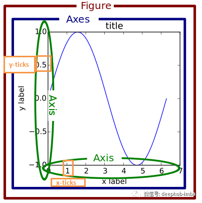
要创建图形,可以使用“pyplot.figure”函数,或使用“pyplot.add_subplot”函数向图中添加轴。
# import matplotlib and Numpy
import matplotlib.pyplot as plt
import numpy as np
# magic command to show figures in jupyter notebook
%matplotlib inline

# create a figure
fig = plt.figure()
# add axes
ax1 = fig.add_subplot(2, 2, 1)
ax2 = fig.add_subplot(2, 2, 2)
ax3 = fig.add_subplot(2, 2, 3)

在上面的代码片段中,我们定义了一个图形,总共最多包含 4 个图。我们正在选择四个子图中的三个。
一个简单的方法是使用“plt.subplots”函数创建一个带轴的图形。
fig, axes = plt.subplots(2, 2)
# first subplot
axes[0, 0].scatter(np.arange(40), np.arange(40) + 4 * np.random.randn(40))
# second subplot
axes[0, 1].plot(np.random.randn(40).cumsum())
# third subplot
_ = axes[1, 0].hist(np.random.randn(100), bins=20)
# fourth subplot
axes[1, 1].bar(np.arange(40), np.arange(40) + 4 * np.random.randn(40))
plt.tight_layout()
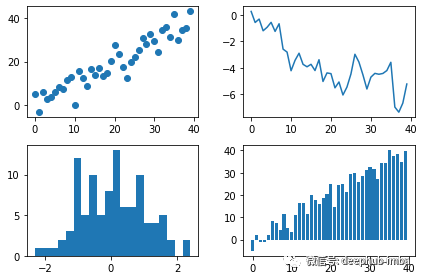
上图包含不同子图类型。可以在 matplotlib 文档中找到完整的绘图类型目录。
‘Plt.tight_layout()’函数用于很好地自动间隔子图并避免拥挤。此外,还可以使用‘plt.subplots_adjust (left = None, bottom = None, top = None, wspace = None, hspace = None)’函数更改图形对象的默认间距。
fig, axes = plt.subplots(2, 2, sharex=True, sharey=True)
for i in range(2):
    for j in range(2):
        axes[i, j].plot(np.random.randn(40).cumsum())
plt.subplots_adjust(wspace=0, hspace=0)

线型、颜色和标记
“plt.plot”函数可以选择接受一个字符串缩写,表示颜色和线条样式。例如我们在下面的代码片段中绘制了一条红色虚线。
fig, ax = plt.subplots()
ax.plot(np.random.randn(30), 'r--')
我们可以通过使用linestyle和color属性来指定线型和颜色。
fig, ax = plt.subplots(1, 1)
ax.plot(np.random.randn(30), linestyle='--', color='r')
matplotlib 中可用的线型有:
 ‘-’: 实线样式
 ‘ — ‘: 虚线样式
 ‘-.’: 点划线样式
  ‘:’ : 虚线样式
除了 matplotlib 提供的颜色缩写之外,我们还可以通过指定其十六进制代码(例如,‘FFFF’)来使用光谱上的任何颜色。
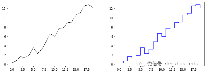
为了绘制线图,matplotlib 在点之间进行插值。可以使用“marker”属性来突出显示实际数据点,如下图所示。
fig, ax = plt.subplots(1, 1)
ax.plot(np.random.randn(30), linestyle='dashed', color='k', marker='o')

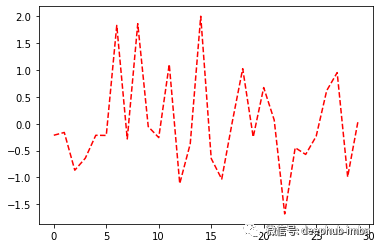
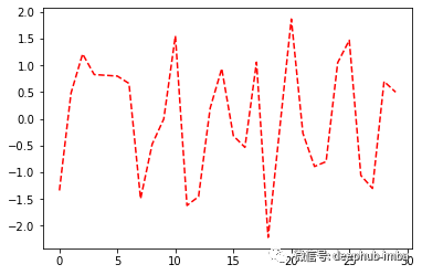
默认插值是线性的;但是可以使用“drawstyle”属性更改它。下面的示例说明了线性插值和步进后插值。
# data
data = np.random.randn(20).cumsum()
# figure
fig, (ax1, ax2) = plt.subplots(1, 2, figsize=(12, 4))
ax1.plot(data, 'k--')
ax2.plot(data, 'b-', drawstyle='steps-post')
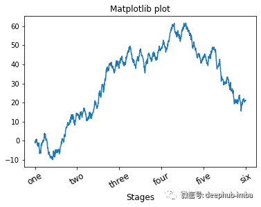
刻度和标签
ax 对象(子图对象)有不同的方法来自定义绘图:
- ‘Set_xticks’和set_xticklabels’改变x轴刻度;
- ‘Set_yticks’和set_yticklabels’改变y轴刻度;
- Set_title '为绘图添加标题。
fig, ax = plt.subplots(1, 1)
ax.plot(np.random.randn(1000).cumsum())
ticks = ax.set_xticks([0, 200, 400, 600, 800, 1000])
labels = ax.set_xticklabels(['one', 'two', 'three', 'four', 'five', 'six'],
                           rotation=30, fontsize=12)
ax.set_title('Matplotlib plot')
ax.set_xlabel('Stages', fontsize=12)
另一种设置绘图属性的方法是使用属性字典的“set”方法。
fig, ax = plt.subplots(1, 1)
ax.plot(np.random.randn(1000).cumsum())
props = {
    'title': 'Matplotlib title',
    'xlabel': 'Stages'
}
ax.set(**props)

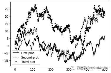
在同一图中绘制不同数据时,图例对于识别图元素至关重要。因此,我们使用标签“label和legend”方法来添加图例。
fig, ax = plt.subplots(1, 1)
ax.plot(np.random.randn(500).cumsum(), 'k', label='First plot')
ax.plot(np.random.randn(500).cumsum(), 'k--', label='Second plot')
ax.plot(np.random.randn(500).cumsum(), 'k.', label='Third plot')
ax.legend(loc='best')
注释
要向子图添加注释,我们可以使用“text”、“arrow”和annotation函数。text会在绘图上的给定坐标 (x, y) 处使用可选的自定义样式绘制文本。
fig, ax = plt.subplots()
ax.plot(np.arange(30), 'k')
ax.text(5, 15, 'Hello world!',
        family='monospace', fontsize=10)

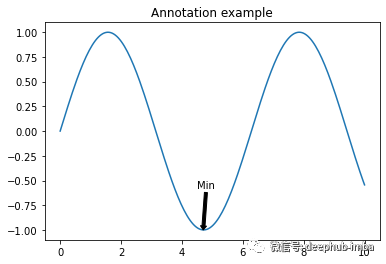
“annotation”方法可以将文字和箭头适当排列。
fig, ax = plt.subplots()
ax.plot(np.linspace(0, 10, 200), np.sin(np.linspace(0, 10, 200)))
ax.annotate('Min', xy=(4.7, -1),
           xytext=(4.5, -0.5),
           arrowprops=dict(facecolor='black', headwidth=6, width=3,
                          headlength=4),
          horizontalalignment='left', verticalalignment='top')
ax.set_title('Annotation example')
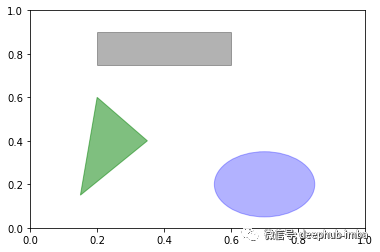
Matplotlib 具有代表许多标准形状的对象,称为patches。像 Rectangle 和 Circle 一样,有些在‘matplotlib.pyplot’中,但整个集合在‘matplotlib.patches’中。
fig, ax = plt.subplots()

rect = plt.Rectangle((0.2, 0.75), 0.4, 0.15, color='k', alpha=0.3)
circ = plt.Circle((0.7, 0.2), 0.15, color='b', alpha=0.3)
pgon = plt.Polygon([[0.15, 0.15], [0.35, 0.4], [0.2, 0.6]],
                    color='g', alpha=0.5)
ax.add_patch(rect)
ax.add_patch(circ)
ax.add_patch(pgon)
保存图像
可以使用“fig.savefig”将要绘图保存在文件中。Matplotlib会从文件扩展名推断文件类型。例如我们使用以下代码来保存图形的 PDF 版本。
fig.savefig(‘figpath.pdf’)
总结
本教程的目标是让你熟悉使用 matplotlib 进行数据可视化的基础知识。希望本篇文章能够对你的工作有所帮助。
作者:Jaouad Eddadsi