
数字角标(uni-badge)
数字角标一般和其它控件(列表、9宫格等)配合使用,用于进行数量提示,默认为实心灰色背景。
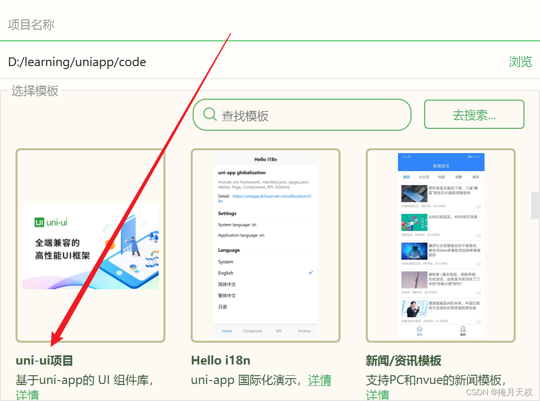
使用方式是在HBuilder中创建项目,选择模板,uni-ui模板,输入名字后点击创建。
创建后,在pages/index/index.vue中,可以直接使用扩展组件,无须另外引入,下载。
代码示例:
<template>
<view class="container">
<view class="intro">本项目已包含uni ui组件,无需import和注册,可直接使用。在代码区键入字母u,即可通过代码助手列出所有可用组件。光标置于组件名称处按F1,即可查看组件文档。</view>
<text class="intro">详见:</text>
<uni-link :href="href" :text="href"></uni-link>
<view>
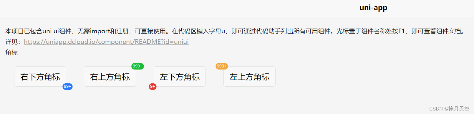
<view class="title">角标</view>
<uni-badge class="ubg" text="99+" type="primary" absolute="rightBottom">
<button type="default">右下方角标</button>
</uni-badge>
<uni-badge class="ubg" text="999+" type="success" absolute="rightTop">
<button type="default">右上方角标</button>
</uni-badge>
<uni-badge class="ubg" text="9+" type="error" absolute="leftBottom">
<button type="default">左下方角标</button>
</uni-badge>
<uni-badge class="ubg" text="999+" type="warning" absolute="leftTop">
<button type="default">左上方角标</button>
</uni-badge>
</view>
</view>
</template>
保存后,点击运行->运行到浏览器中后,就可以看到具体样式:
uni-app官网uni-app,uniCloud,serverlesshttps://uniapp.dcloud.net.cn/component/uniui/uni-badge.html
面包屑(uni-breadcrumb)
显示当前页面的路径,快速返回之前的任意页面。
代码示例:
<template>
<view class="container">
<view>
<uni-breadcrumb separator="/">
<uni-breadcrumb-item v-for="(route,index) in routes" :key="index" :to="route.to">
{{route.name}}
</uni-breadcrumb-item>
</uni-breadcrumb>
</view>
</view>
</template>
<script>
export default {
data() {
return {
routes: [
{
to: "/A",
name: "A页面",
},
{
to: "/B",
name: "B页面",
},
{
to: "/C",
name: "C页面",
},
],
}
},
}
</script>
运行后效果:
当鼠标悬浮到B页面上时,会高亮显示,如果绑定了vue文件,点击后会跳转到该页面。

uni-app官网uni-app,uniCloud,serverlesshttps://uniapp.dcloud.net.cn/component/uniui/uni-breadcrumb.html
日历
日历组件可以查看日期,选择任意范围内的日期,打点操作。常用场景如:酒店日期预订、火车机票选择购买日期、上下班打卡等。
注意:
本组件农历转换使用的js是 @1900-2100区间内的公历、农历互转
date属性传入的应该是一个 String ,如: 2019-06-27 ,而不是 new Date()
通过
insert属性来确定当前的事件是 @change 还是 @confirm 。理应合并为一个事件,但是为了区分模式,现使用两个事件,这里需要注意
弹窗模式下无法阻止后面的元素滚动,如有需要阻止,请在弹窗弹出后,手动设置滚动元素为不可滚动
代码示例
<uni-calendar :insert="true" :lunar="true" :start-date="'2023-01-01'" :end-date="'2023-12-30'" @change="change" />
属性名类型默认值说明dateString-自定义当前时间,默认为今天lunarBooleanfalse显示农历startDateString-日期选择范围-开始日期endDateString-日期选择范围-结束日期rangeBooleanfalse范围选择insertBooleanfalse插入模式,可选值,ture:插入模式;false:弹窗模式;默认为插入模式clearDateBooleantrue弹窗模式是否清空上次选择内容selectedArray-打点,期待格式[{date: '2019-06-27', info: '签到', data: { custom: '自定义信息', name: '自定义消息头',xxx:xxx... }}]showMonthBooleantrue是否显示月份为背景
注意:
start-date和end-date的值,双引号中还有一层单引号。表示值为字符串。
uni-app官网uni-app,uniCloud,serverlesshttps://uniapp.dcloud.net.cn/component/uniui/uni-calendar.html
卡片(uni-card)
卡片组件通用来显示完整独立的一段信息,同时让用户理解他的作用。例如一篇文章的预览图、作者信息、时间等,卡片通常是更复杂和更详细信息的入口点。
属性名类型默认值说明titleString-标题文字sub-titleString-副标题文字extraString-标题额外信息thumbnailString-标题左侧缩略图,支持网络图片,本地图片,本图片需要传入一个绝对路径,如:
/static/xxx.png
coverString-封面图,支持网络图片,本地图片,本图片需要传入一个绝对路径,如:
/static/xxx.png
is-fullBooleanfalse卡片内容是否通栏,为true时将去除padding值is-shadowBooleanfalse卡片内容是否开启阴影shadowString0px 0px 3px 1px rgba(0, 0, 0, 0.08)卡片阴影,需符合 css 值borderBooleantrue卡片边框marginString10px卡片外边距spacingString10px卡片内边距paddingString10px卡片内容内边距borderBooleantrue卡片边框mode[弃用]Stringbasic卡片模式 ,可选值, basic:基础卡片 ;style :图文卡片 ; title :标题卡片note[弃用]String-底部信息
代码示例
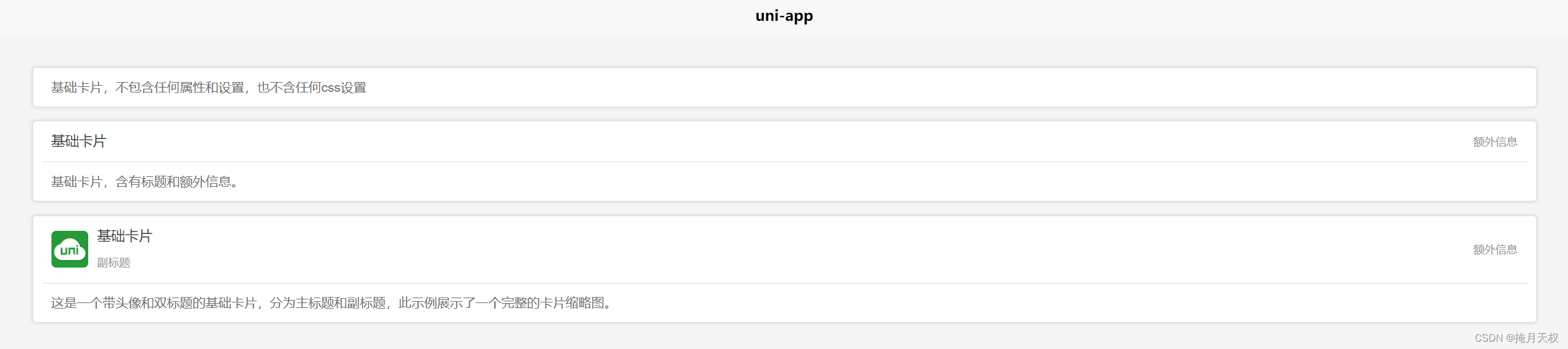
<view class="card-container">
    <uni-card>
        <view>
            基础卡片,不包含任何属性和设置,也不含任何css设置
        </view>
    </uni-card>
    <uni-card title="基础卡片" extra="额外信息" >
        <view>基础卡片,含有标题和额外信息。</view>
    </uni-card>
    <uni-card title="基础卡片" sub-title="副标题" extra="额外信息" thumbnail="https://web-assets.dcloud.net.cn/unidoc/zh/unicloudlogo.png">
        <view>这是一个带头像和双标题的基础卡片,分为主标题和副标题,此示例展示了一个完整的卡片缩略图。</view>
    </uni-card>
</view>
运行效果为:
uni-app官网
倒计时(uni-countdown)
代码示例
<view class="title">一般用法</view>
<uni-countdown :day="1" :hour="1" :minute="12" :second="40"></uni-countdown>
<view class="title">不显示天数</view>
<uni-countdown :show-day="false" :hour="12" :minute="12" :second="12"></uni-countdown>
<view class="title">修改背景颜色</view>
<uni-countdown color="#FFFFFF" background-color="#00B26A" border-color="#00B26A" :day="1" :hour="2" :minute="30" :second="0"></uni-countdown>
运行效果

更多内容请访问官网
uni-app官网uni-app,uniCloud,serverlesshttps://uniapp.dcloud.net.cn/component/uniui/uni-ui.html
版权归原作者 掩月天权 所有, 如有侵权,请联系我们删除。